
2021
McDonalds
2-in-1 residential fire extinguisher.
One extinguisher. Two lives saved: your home, your future.
Enterprise
Smart Gadget
McDonalds Projects
Designing across data, digital products and immersive experiences
I contributed to 6+ McDonald’s projects across enterprise UX, data visualisation, real-time analytics and immersive design.
Different problems. Different scales. One opportunity to design for one of the world’s most recognisable brands.
1. MOSOT: Turning a global volume of business data into an understandable decision-making experience.
McDonald’s VR Meetup Space: Reimagining the client meeting as an immersive spatial experience.
RT Dashboard: Making real-time restaurant and transaction data visible through a single operational view.
McD Edge: Exploring how edge AI and computer vision could translate into practical restaurant experiences.
Geospatial Analytics Platform: Working with location-based business information to make geographic patterns easier to explore.
Menu Catalog Form: Replacing fragmented menu documentation with a structured digital workflow.
Together, these projects became an unusual cross-section of my design practice: from enterprise systems to physical space, from structured data to emerging technology.

MOSOT
MOSOT
Making a global business intelligible. McDonald’s One Source of Truth.
MOSOT was built to give McDonald’s leadership a timely, accessible view of business performance across markets, with a common reporting experience spanning sales, restaurants, digital, brand, market share, macroeconomic conditions and quarterly business review.
The scale is significant:
100+ markets · 39K stores · 250K menu items · 70M+ customers/day
The challenge wasn't a lack of data. It was making that data timely, accessible and useful for decision-making

MOSOT- Problem
FROM FRAGMENTED DATA TO DECISION
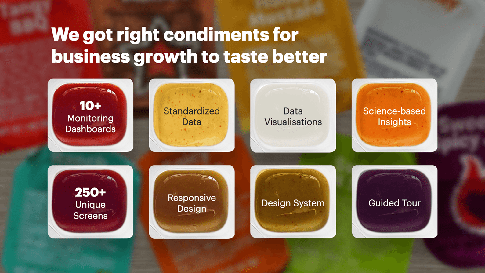
McDonald’s operates across hundreds of markets, thousands of restaurants and an enormous number of business signals. MOSOT brings together 10+ monitoring dashboards, standardized data, data visualizations and science-based insights across 250+ screens.
That creates a UX problem that is easy to underestimate: How do you give an executive enough information to understand the business without making them understand the system first?
The product therefore had to support two very different behaviours:
SCAN: A leader wants to quickly understand:
What changed?
Is performance improving?
Where should I pay attention?
INVESTIGATE: Once something looks interesting:
Which market?
What changed over time?
How does it compare?
What is driving it?
Can I get to the underlying metric?
This distinction is visible throughout the supplied screens. The Executive KPIs page surfaces headlines and high-level metrics, while Sales & Guest Counts subsequently exposes market, time and daypart analysis.
MOSOT- Info. Arch.
AN INFORMATION ARCHITECTURE BUILT AROUND THE BUSINESS
The MOSOT home screen is revealing.
Instead of presenting users with technical concepts, the system exposes business domains:
Executive Summary
Sales & Guest Counts
Running Great Restaurants
Digital
Market Share
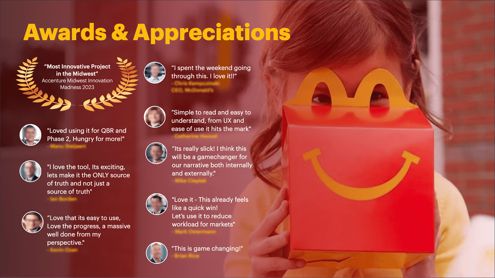
Brand Image
DASH
Seasonally Adjusted Trend Lines
Glossary
User Management
The supplied overview explains what each domain represents. For example, Sales & Guest Counts covers the latest full-month performance across global, top markets and individual markets, while Brand Image tracks customer attributes and competitors.
That means the IA is fundamentally business-question oriented. Users don't need to understand how the data pipeline is built. They need to know: “Where would I go to answer this question?”
Enterprise IA research shows that navigation becomes difficult when categories are broad, ambiguous or organized around the structure of the organization rather than how users seek information. NN/G recommends descriptive, specific and mutually exclusive categories.

MOSOT: Eecutive Summary
THE EXECUTIVE LAYER
The Executive KPIs screen is not simply another dashboard. It is an aggregation layer.
Before exploring the business, know what changed. The Executive Summary became the orientation layer of MOSOT.
Instead of asking a leader to browse multiple dashboards, it brings the most important signals into one view.
It brings together signals from multiple parts of the business:
Sales & Guest Counts
Brand Image
Macro Environment
Running Great Restaurants
Digital
Market Share
SATL
And before those detailed sections, it presents Key Headlines. The supplied screen shows headlines such as Comp Sales, Total Digital % of Sales, In-Restaurant R2P, CSAT and Drive Thru OEPE, followed by the underlying business metrics.
That creates a very deliberate hierarchy:
EXECUTIVE QUESTION "How are we doing?"
↓
KEY HEADLINES "What changed?"
↓
BUSINESS SIGNALS "Which area?"
↓
DOMAIN DASHBOARD "Why?"
↓
DETAILED ANALYSIS
The Executive Summary is not intended to replace the deeper dashboards. It is intended to route attention toward them. That distinction is important. Tableau's research on visual analysis similarly describes analysis as beginning with a broad business question and progressively becoming more specific.


MOSOT- Metric Structuring
ONE DOMAIN. FOUR WAYS OF THINKING.
Take Sales & Guest Counts. At first glance it looks like one section.
But the actual product reveals four different analytical modes:
Summary
Results by Market
Trend Over Time
Results by Daypart
The same business domain therefore supports fundamentally different questions.
SUMMARY "How are sales and guest counts performing?:
The supplied screen shows Comp Sales, Comp GCs, Average Check, Systemwide Sales, Systemwide GCs, Average Store Volumes, Store Reporting and Share of System.
RESULTS BY MARKET "Where is performance coming from?"
The screen compares markets including the United States, Australia, Canada, France, Germany, UK, Italy, Spain, China and Japan.
TREND OVER TIME "Is this movement temporary or persistent?"
The screen provides historical monthly values and visual trends.
RESULTS BY DAYPART "When is the performance happening?"
The interface allows Daypart selection such as Breakfast and exposes additional channel-related filtering where applicable.

MOSOT- Data Context
CONTEXT BECAME PART OF THE INTERFACE
Look carefully at the filters across MOSOT. The interface repeatedly establishes context through:
Reporting Period
Frequency
Report Type
Specific Market
Currency
Daypart
History
Segment
Placed Order Channel where applicable
For example,
The supplied Sales & Guest Counts screen can be configured around: Jul 2025 · Monthly · Individual Market · United States · USD · Breakfast
Another state uses: Jul 2025 · Monthly · Total QSR Corporation · Breakfast
And Trend Over Time adds 12 Months of history.
That is not merely filtering. It establishes the meaning of the number currently being viewed.
Context needs to remain visible. The system therefore repeatedly expresses analytical state alongside the content:
As of Jul 2025 | Individual Market | United States | $USD | Daypart: Breakfast
This prevents a user from reading a metric as if it were universal when it is actually scoped.
Tableau's dashboard guidance explicitly recommends using filters to let users specify which data is shown, while emphasizing that dashboard design should begin with a clear audience and purpose.
MOSOT- Data Viz & Layout
DESIGNING THE LANGUAGE OF DATA
The screens show several distinct visual languages.
KPI CARD: What is the current state?
BAR / COMPARISON: How do markets compare?
LINE CHART: How has it changed over time?
COMPETITOR GAP: How are we performing against the relevant competitor?
SATL: What is the underlying long-term movement after seasonal and trading-day effects?
Choose the visual form from the question, not the dataset:
For comparison, use comparison.
For change over time, use time.
For exact values, give users the table.
For relationships, make the relationship visually explicit.
This aligns with established visual-analysis principles: the representation should support the analytical task rather than forcing users to decode the visualization first.

MOSOT- Trust As Experience
ONE SOURCE OF TRUTH NEEDS A TRUST LAYER
Making information accessible isn't enough. Users need to understand where it came from. The product doesn't stop at charts and KPIs. Every analytical experience is supported by a layer of explanation and governance.
GLOSSARY: Metrics, terminology and acronyms are searchable and defined in context.
DATA SOURCE: Users can identify where the underlying information comes from.
LAST UPDATED: Freshness of information is made explicit.
GUIDED TOUR: New users can learn how to navigate the product.
DOWNLOAD: Data and views can be taken into downstream reporting workflows.
FEEDBACK: Users can submit feedback against a specific dashboard or page, attach supporting files and track its status.
Then comes the administrative side of the system. Admins can:
Create access
Grant access
Remove access
Manage market permissions
Manage access types
Review user access
Review login activity
The system therefore operates across three layers.
MOSOT- Impact
FROM INFORMATION TO IMPACT
The measure of the experience was not how much data MOSOT contained. It was how quickly that data could become useful.
MOSOT reached 300+ business users, including the McDonald's CEO.
The availability of key business-value KPIs for markets was reduced from months to 1–2 days.
And the effort required to generate the Quarterly Business Review report was reduced by 60–70%.
These outcomes connect directly back to the UX problem:
LESS WAITING: Information becomes available sooner.
LESS MANUAL WORK: Reporting requires less effort.
LESS SEARCHING: Business signals are organized around recognizable domains.
MORE INVESTIGATION: Users can move from headline to underlying evidence without leaving the system.
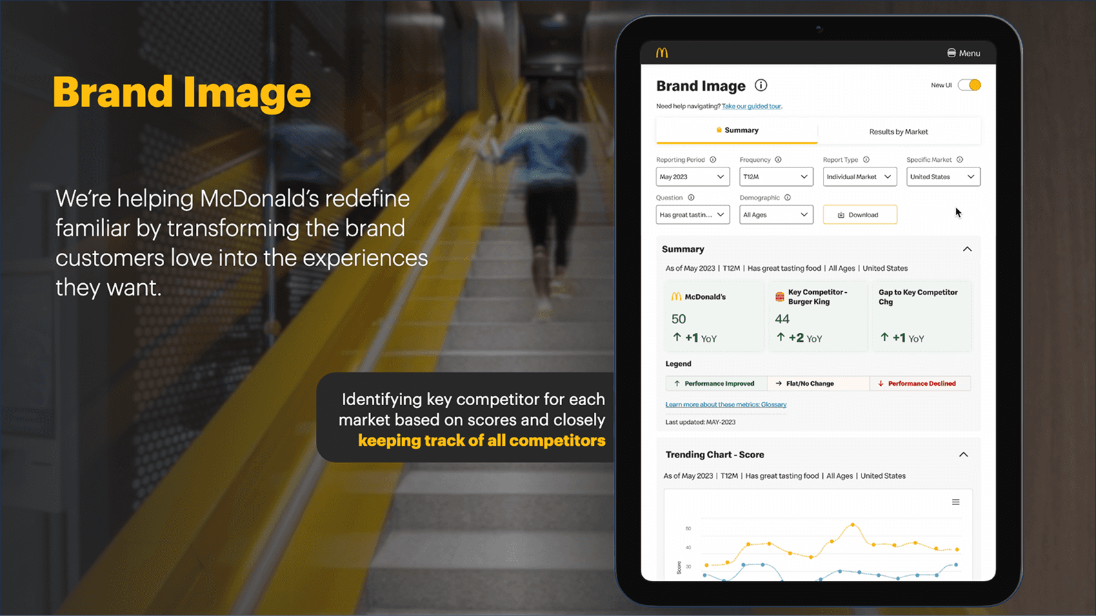
The product was ultimately recognized as “Most Innovative Project in the Midwest” at Accenture Midwest Innovation Madness 2023.
Stakeholder feedback reinforced the same themes: ease of understanding, ease of use, QBR usefulness, reduced workload and the ambition for MOSOT to become the definitive source of truth.

VR Meetup
McDonald’s VR Meetup Space
Designing a client meeting as an experience
A virtual meeting space created for McDonald’s client visits, built as part of Accenture’s emerging Metaverse practice.
Instead of reproducing a conventional meeting room in VR, the experience explored how space, brand, interaction and storytelling could make a simple client meeting feel memorable.
My role: 3D Designer · Architect
Focus: Spatial experience · Interior design · 3D design
Tools: Blender · Spatial.io


VR Meetup: Brief
What if a client meeting didn't feel like a meeting?
The objective was to create a virtual environment where Accenture and McDonald’s teams could meet, explore ideas and spend time together in a more engaging way.
That meant thinking about:
How people enter and orient themselves
Where people naturally gather
How the environment communicates the McDonald’s brand
Where a meeting can happen without feeling like a conference room
How movement and discovery can become part of the experience
How the environment can support both an agenda and informal interaction

VR Meetup: Spatial Design
The environment became the product.
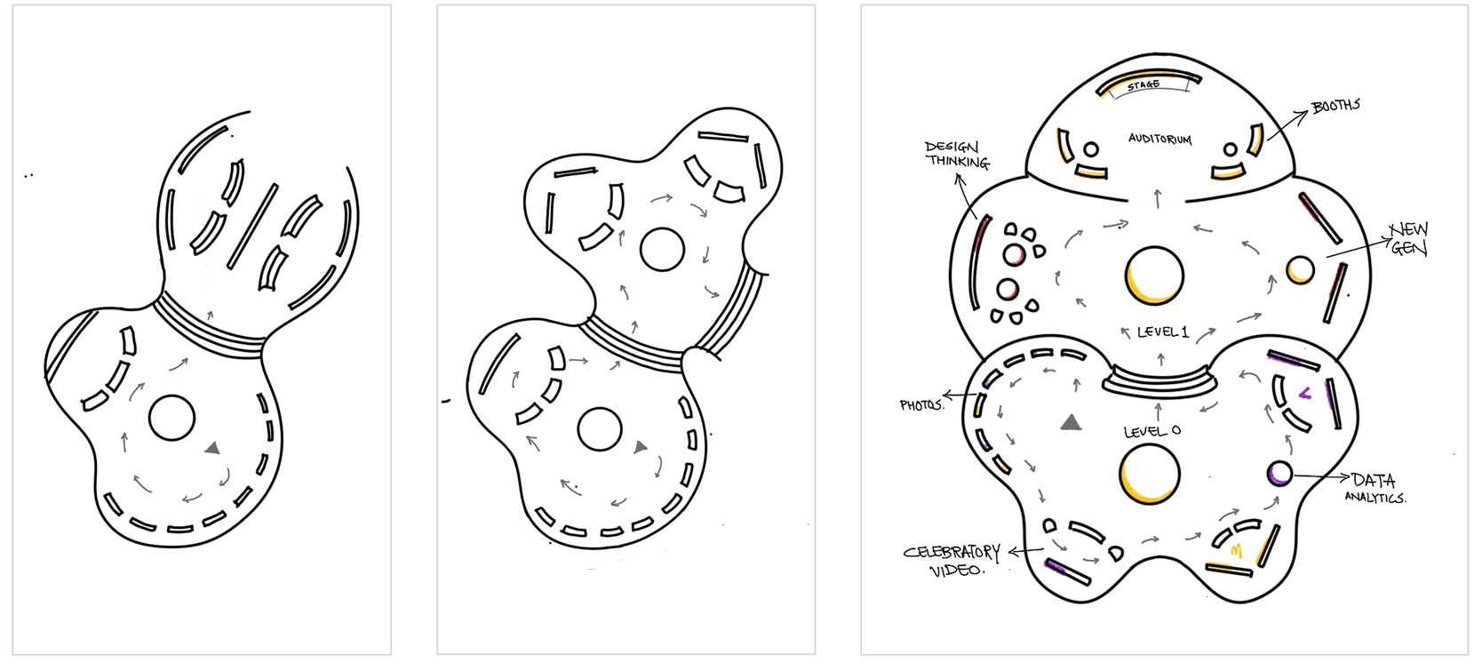
The experience was designed as a larger-than-life McDonald’s environment, combining recognizable brand elements with a deliberately playful spatial language.
Rather than filling the environment with interfaces, the design relied on:
Scale: Large architectural elements create a sense of occasion.
Landmarks: Distinct spaces help users understand where they are and where they can go.
Brand cues: McDonald’s visual language is embedded into the architecture rather than simply placed on top of it.
Social spaces: The environment supports gathering and informal interaction alongside the formal meeting.
This required approaching VR more like architecture than screen design. Every wall, object, pathway and focal point had to contribute to orientation or experience.
My focus was specifically on the spatial experience and interiors, translating the meeting requirement into an environment that could be built and experienced in Spatial.io.

VR Meetup: Loving it
The final experience went beyond a virtual conference setup.
The environment created opportunities to catch up on the agenda, explore the space and create memorable interactions together.
One of the characters became part of this experience: Grim, McDonald’s iconic character, was modelled and animated as an interactive element within the environment.
This introduced something that a traditional meeting space cannot easily provide: A sense of play. The environment could now contain moments of discovery and personality alongside the formal meeting.
That became an important part of the experience design: Don't replicate everything that happens in a physical meeting. Use the medium to create things that physical space cannot.
The project was therefore less about creating a realistic office and more about using the freedom of a virtual environment to make the interaction feel distinctly different.

VR Meetup: Loving it
A successful experiment in making digital space feel humanly social.
The project received strong client appreciation, with the work described as making the client meeting unforgettable.
The client supported the creation of several versions of the experience, while Grim became a particularly well-received interactive element.
The project also received an ACE Award.
For me, the value of the project was bigger than the final environment.
It expanded my understanding of what product and experience design can mean when the interface is no longer a screen.
I moved from designing interfaces...
...to designing environments people inhabit.
