
2021
Roche
UX across Roche's internal product ecosystem.
The five projects become five expressions of the same problem.
Enterprise
Multi-step forms
Workflows
Intro
At Roche, I worked across several internal products where the challenge was turning complex information, workflows and rules into usable interfaces.
Five products. Five different problems.
Integration ProTools: Managing 16+ integration utilities
EVAL: Calculating scores and managing evidence
External Partner Portal: Guiding external partners through onboarding
BAR: Working through case-based assessments
PEEPS+: Connecting people, teams and internal resources
To study the project's UI & UX, please go through the link below. If you do not have the access please connect with me.
Roche Context
One ecosystem. Very different workflows.
During my time with the Roche team, I worked across several internal products — from integration utilities and assessment tools to partner onboarding and employee networking.
The products were different, but a pattern kept emerging: complex information had to become usable work.

Integration ProTools
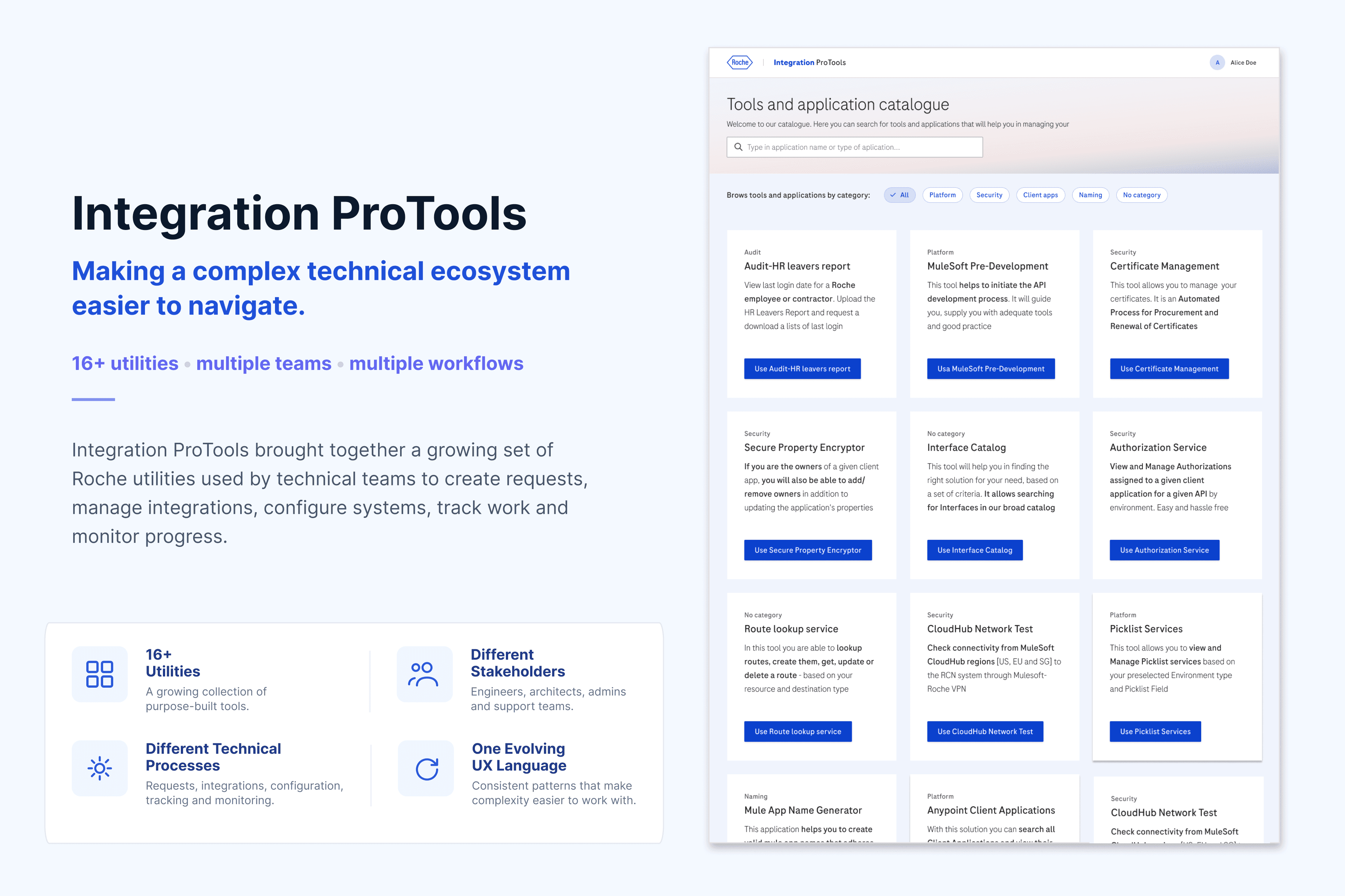
Integration Protools: 16+ utilities. Different teams. One ecosystem.
Integration ProTools was not a single product.
It was a growing collection of Roche utilities used by technical teams to manage integration requests, assets, enablement, configuration and operational workflows.
Each utility came with its own:
stakeholder group
terminology
business rules
data requirements
filters and tables
workflow
level of technical complexity
And the design challenge was often time-bound: Understand → structure → design → validate
Each utility in a matter of days, not weeks.
Challenges of ProTools
Every utility came with a different problem to understand.
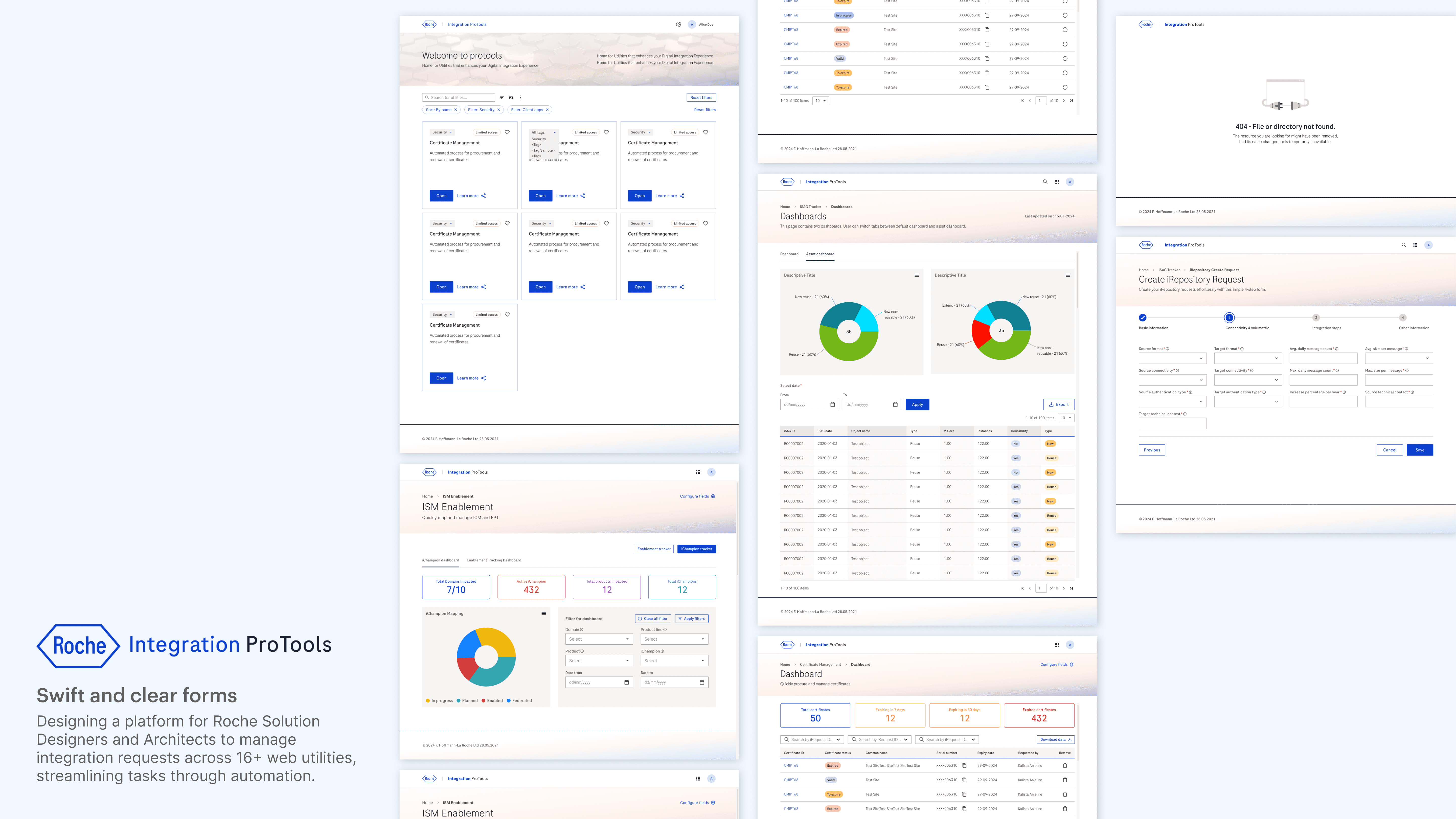
I worked directly with utility stakeholders to understand their processes, clarify requirements and translate technical workflows into usable interfaces.
Each utility had to move from conversation to workable design in a matter of days, so wireframes became an important tool for quickly aligning on the solution.
My role was to translate:
technical requirements → user workflows → interface decisions
01 — Interview
Understand what the team actually does today.
02 — Define
Clarify requirements, fields, filters, states and dependencies.
03 — Structure
Turn the process into information architecture and user flows.
04 — Wireframe
Bring the proposed solution back to stakeholders quickly.
05 — Iterate
Resolve gaps, edge cases and workflow questions.
06 — Detail
Move validated flows into high-fidelity UI and development handoff.

Integration ProTools
Understand first. Make tangible quickly.
Integration ProTools was not a single product.
It was a growing collection of Roche utilities used by technical teams to manage integration requests, assets, enablement, configuration and operational workflows.
Each utility came with its own:
stakeholder group
terminology
business rules
data requirements
filters and tables
workflow
level of technical complexity
And the design challenge was often time-bound: Understand → structure → design → validate
Each utility in a matter of days, not weeks.

EVAL - Evidence for Value
EVAL: The design opportunity was to turn static data into a guided decision-making workflow.
Turning a spreadsheet-based evaluation process into a product.
EVAL was built around a process that previously lived in Excel. The challenge was not simply to reproduce the spreadsheet on screen, but to turn its logic into a workflow that people could navigate, understand and maintain.

EVAL - Scoring workflow
I structured the experience around the decision being made, rather than the spreadsheet fields that originally contained the information.
From data points to an explainable EVAL score
The core workflow starts from the evaluation log and moves into Generate EVAL Score.
The designed flow brings the relevant variables together - including Primary study purpose, Governance status, Value metrics/Lever, Path of communication, Study priority and PYS range - and uses them as the inputs to generate the score.

EVAL - Evaluation maintainance
Making the evaluation maintainable
The score was only one part of the product.
Once an evaluation was created, the system also needed to preserve context and make changes understandable.
The flow includes:
Audit log: Who changed the evaluation and when.
Change history: Previous and updated values can be compared.
Save / discard states: Users are prompted when leaving with unsaved changes.
Administration space: Dropdown values can be added, removed and edited without redesigning the product.

EVAL - Admin Space
A Simple example of admin space
I separated the assessment experience from the vocabulary behind it.
EVAL relies on controlled inputs such as Primary study purpose, Value metrics / Lever, Path of communication, PYS range, and Governance status. Instead of hard-coding these values into the assessment experience, I designed an Administration space where they could be maintained independently.
The UX decision was to make the interface configurable, which keeps the input fields updated according to times.


BAR & RISK - Context
A complex assessment, hiding behind a simple interface
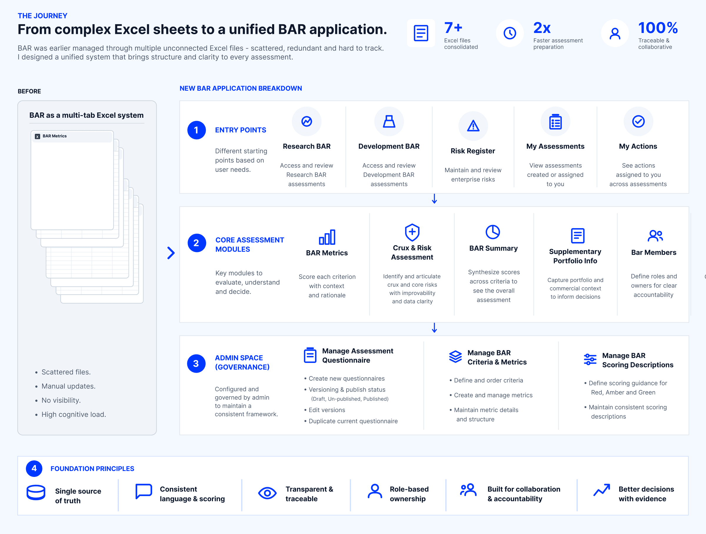
BAR brought together assessment criteria, risk, project information, scoring, people and review into one workflow. The challenge was not simply to digitise the assessment, but to make a large body of information understandable and actionable.
The registry itself had to support different entry points, including Research BAR, Development BAR, Risk Register, My Assessments and My Actions.
The first design problem was understanding the system, not designing the screen.
BAR & RISK - Approach
Breaking one large assessment into decision contexts
Rather than treating the assessment as a long form, I structured it around the way the work was actually organised.
The assessment was divided into dedicated spaces for BAR Metrics, Crux & Risk Assessment, BAR Summary, Supplementary Portfolio Information and Bar Members, with the audit layer available alongside the work.

BAR & RISK - Assess
Making judgement structured & explainable
Each BAR metric needed more than a colour-coded score. The interaction captures the rating, feasibility of improving the rating, data availability, assessor, comments and rationale, with the option to carry rationale into the summary and presentation.
This gave the assessment a consistent way to capture not only what the judgement was, but why.
A score is useful only when the reasoning behind it survives.

BAR & RISK - Score Logic
Making every score explainable
A colour tells you the outcome. The scoring description explains the judgement.
BAR assessments often depend on expert judgement, so a Red, Amber or Green rating alone isn't enough. I introduced context-specific scoring descriptions for every criterion, giving assessors clear definitions of what each decision means.
Selecting a score opens its corresponding guidance, helping users interpret the criteria consistently, make informed judgements, and understand why a rating applies: without leaving the assessment flow.

BAR & RISK - Risk
Connecting risk to the evidence behind it
Risk was not treated as a separate warning layer. The Crux & Risk Assessment connects a crux and core risks back to BAR metrics, while capturing improvability, data availability, pivot points and stopping points.
The design makes the relationship between assessment → risk → action easier to follow.
Don't just flag the risk. Show what it changes.

BAR & RISK - Collaboration
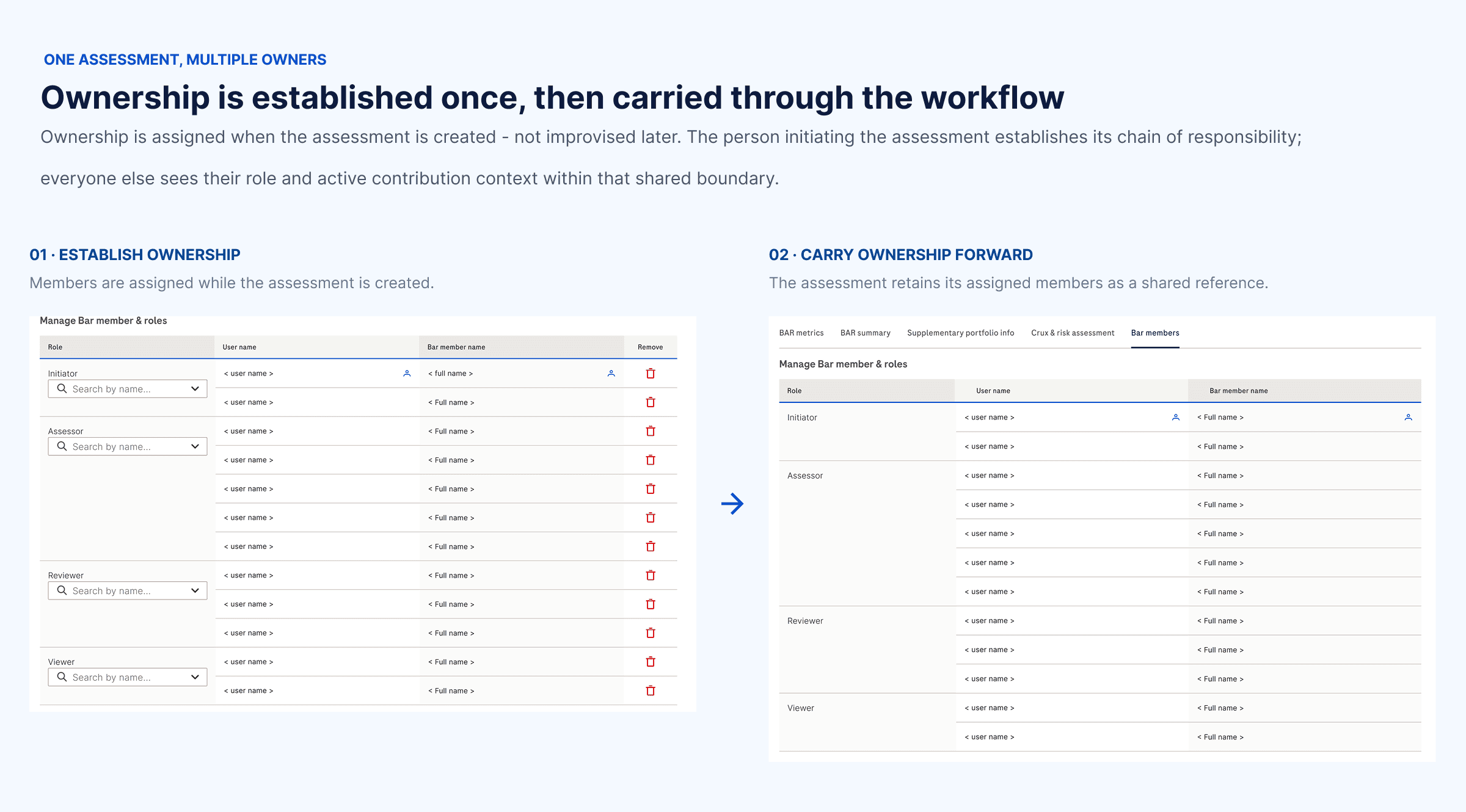
Ownership is assigned when the assessment is created : not improvised later.
A BAR assessment can involve several people, but not everyone should have the same control over it.
During assessment creation, the appropriate owner/lead assigns the BAR members and their roles. Once the assessment exists, the Bar members tab becomes a view of that established ownership: showing who is attached to the assessment and their role.
This separates two things that are easy to blur in complex workflows: Who controls the assessment, from Who is responsible for assessing it.
It gives the assessment a clear chain of responsibility while allowing multiple people to contribute to the decision.
BAR & RISK - GOVERN
Designing the system of the assessment
The assessment framework itself needed to evolve. The Admin Space provides control over the questionnaire, BAR criteria and metrics, and scoring descriptions, including drafts, versions, publishing and metric management.
This meant the product could maintain the rules of the assessment without changing the core experience for every user.
A scalable product needs a way to maintain its own rules.
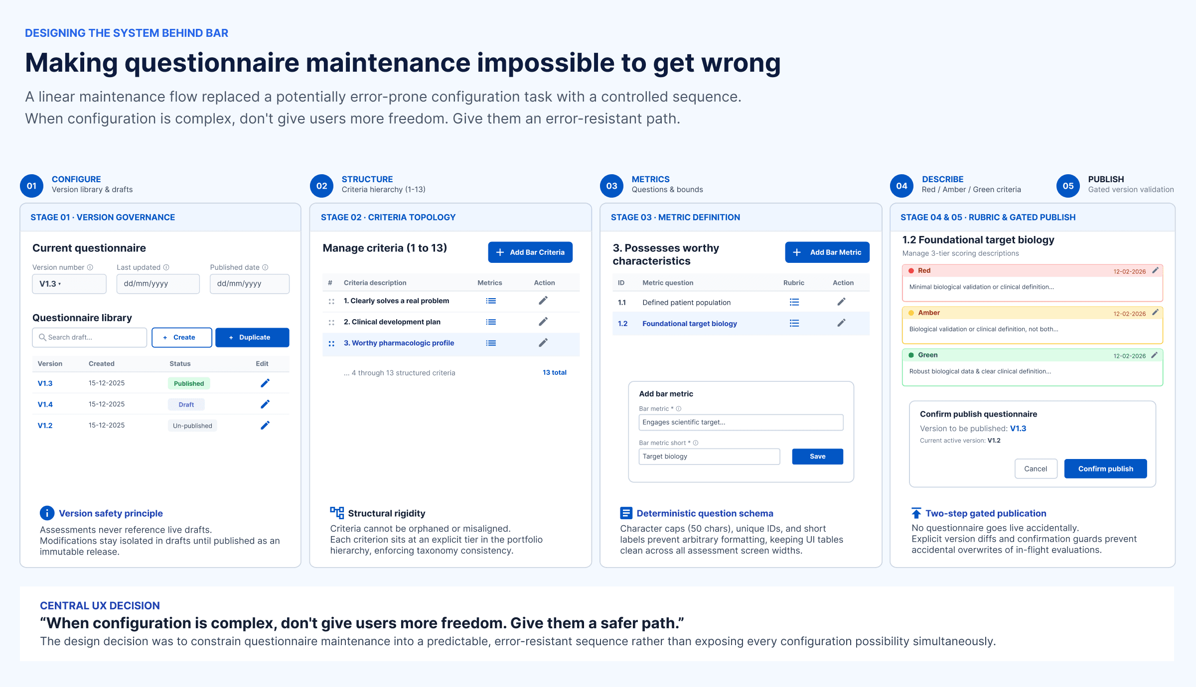
BAR & RISK - GOVERN
Designing the system of the assessment
The assessment framework itself needed to evolve. The Admin Space provides control over the questionnaire, BAR criteria and metrics, and scoring descriptions, including drafts, versions, publishing and metric management.
This meant the product could maintain the rules of the assessment without changing the core experience for every user.
A scalable product needs a way to maintain its own rules.
