2021
Fresenius 4008S Classix
A story of silence, clarity, and care — during the most vulnerable hours of human life, dialysis.
Human Machine Interface
Healthcare
Brief
Healing through design. A UX and Interface Redesign of the Fresenius 4008S Classix Dialysis Machine
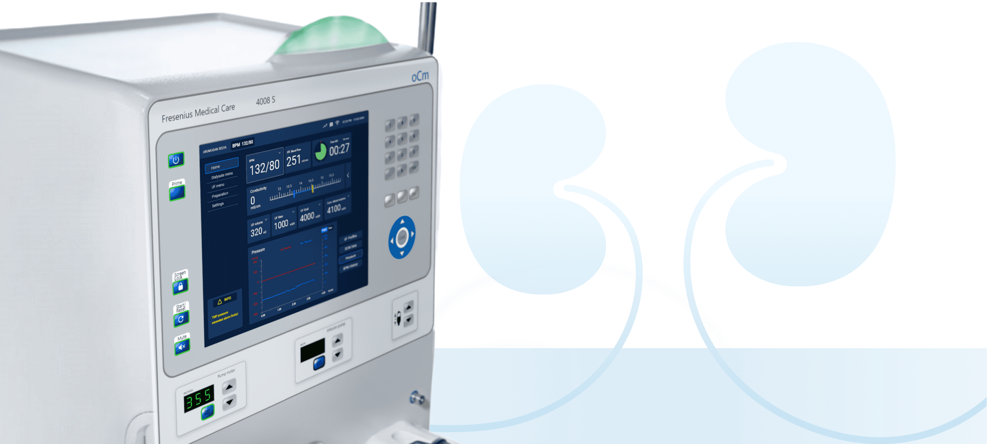
Redesigned the dialysis machine interface to reduce cognitive load and enhance clarity. I streamlined data, replaced outdated LEDs with contextual cues, refined alert sounds, and introduced a calm, touchscreen-led UI supported by tactile controls—creating a quieter, more intuitive experience for staff and patients.

Problem
Pain points in the world of dialysis. Too many interfaces. Too little clarity.
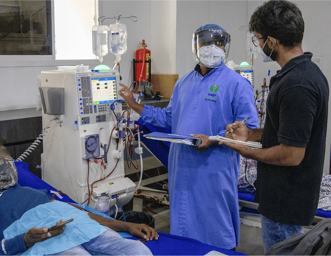
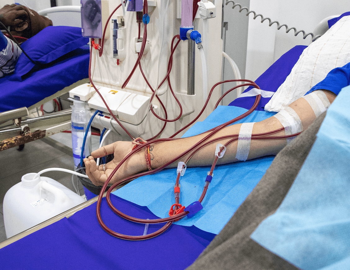
Hemodialysis is a 4-hour, physically draining process for patients. Nurses manage 10–15 machines simultaneously. Each machine flashes, beeps, and overwhelms. Design, here, isn’t for delight. It’s for relief.
Technicians were overworked. Patients just wanted calm. And the machine stood between them and relief.
⚠️ Observed Pain Points:
Redundant Information: The same alarm repeated visually and audibly in multiple places.
Poor Visual Hierarchy: Critical vs non-critical alerts looked and sounded the same.
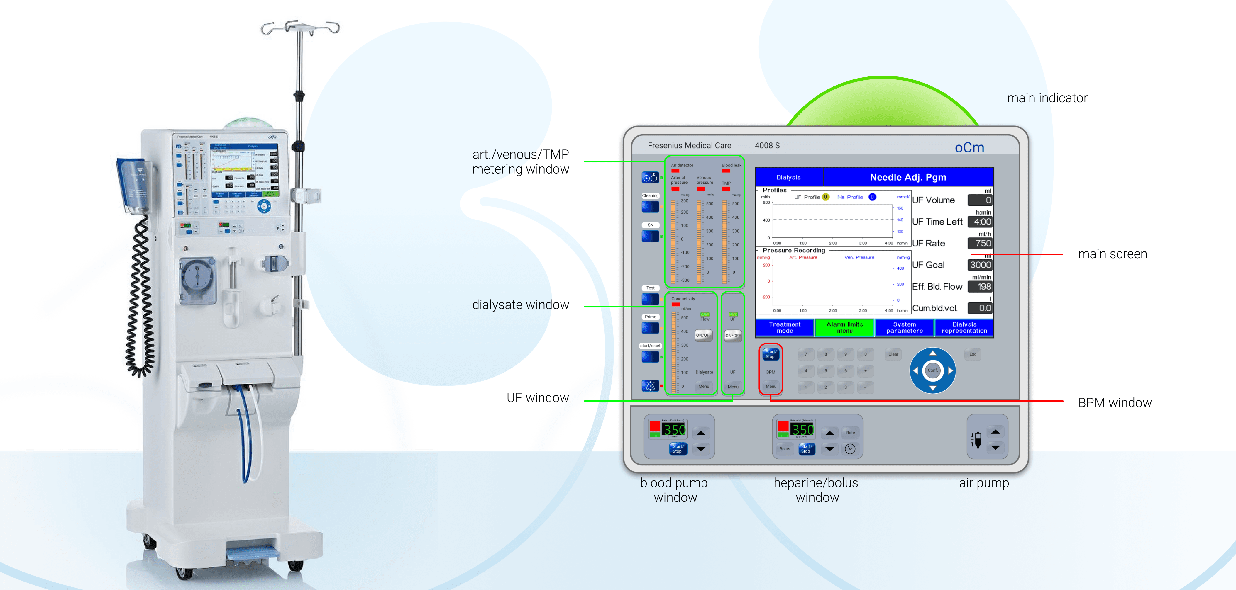
Overwhelming GUI: Cramped screens, poor typography, and inconsistent iconography.
Physical Design Misalignment: Membrane buttons were disorganized and hard to read.
Cognitive Fatigue: Long shifts + unclear interfaces = mental exhaustion for nurses.
Research
“The challenge was to reimagine the dialysis experience for both staff and patient — less noise, more clarity.”
Research & Observations
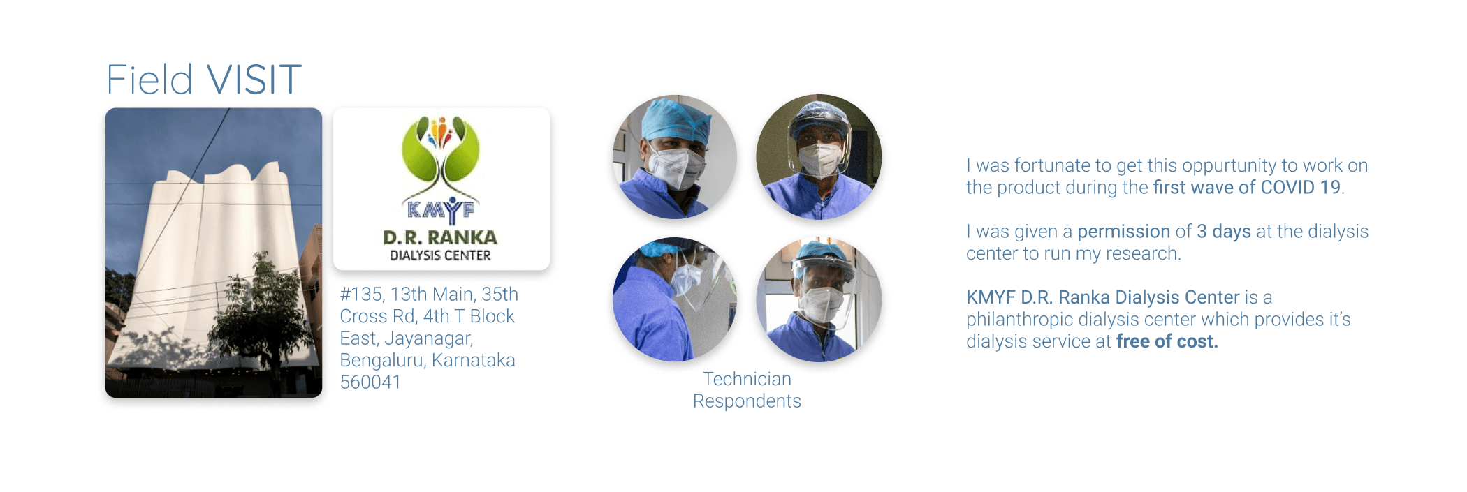
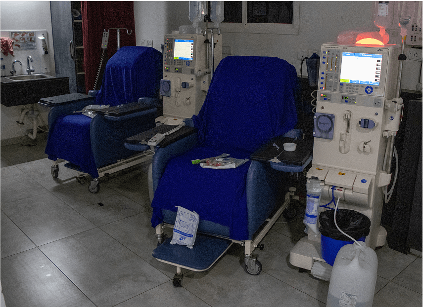
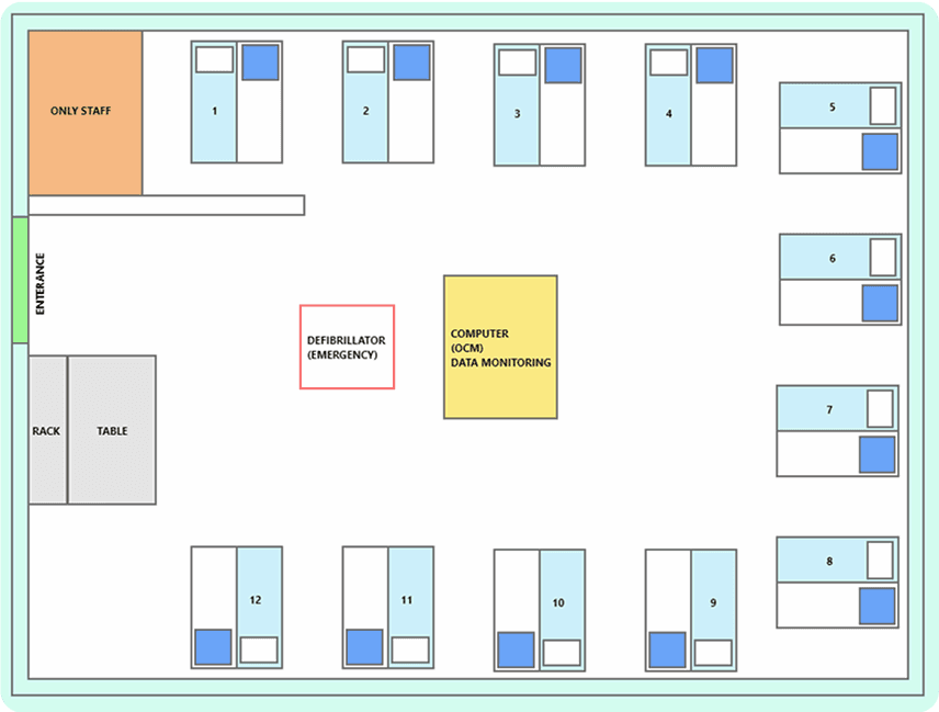
Ethnographic research: I spent time observing nurses managing up to 12 patients with just 3 technicians.
Pain point interviews: Conducted informal interviews with technicians and one nephrologist.
Interface audit: Studied all physical controls, alarm mechanisms, screens, and labeling.
Key insights:
Staff wanted a decluttered interface with better task sequencing.
Patients preferred calm, non-intrusive indicators.
Touchscreens offered speed but needed fallback options.

Research
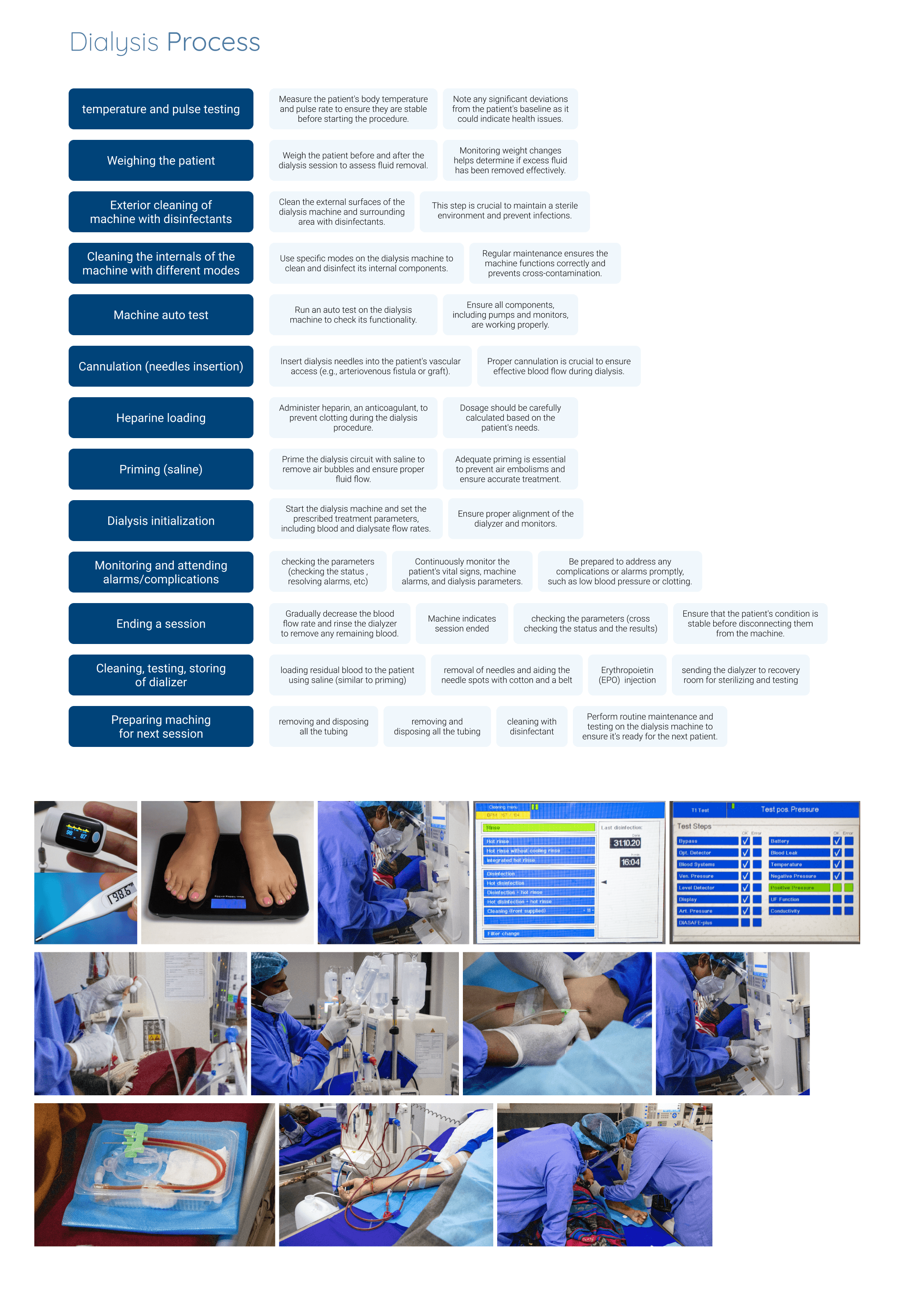
End to end process observation
I mapped the entire dialysis process end to end, observing both staff and patient interactions to identify moments of high stress. Seeing it unfold in real-time—alarms going off, nurses juggling multiple patients, and patients trying to rest—gave me a deeper, more human understanding of where the design was failing. These insights became the foundation for every design decision that followed.
Research
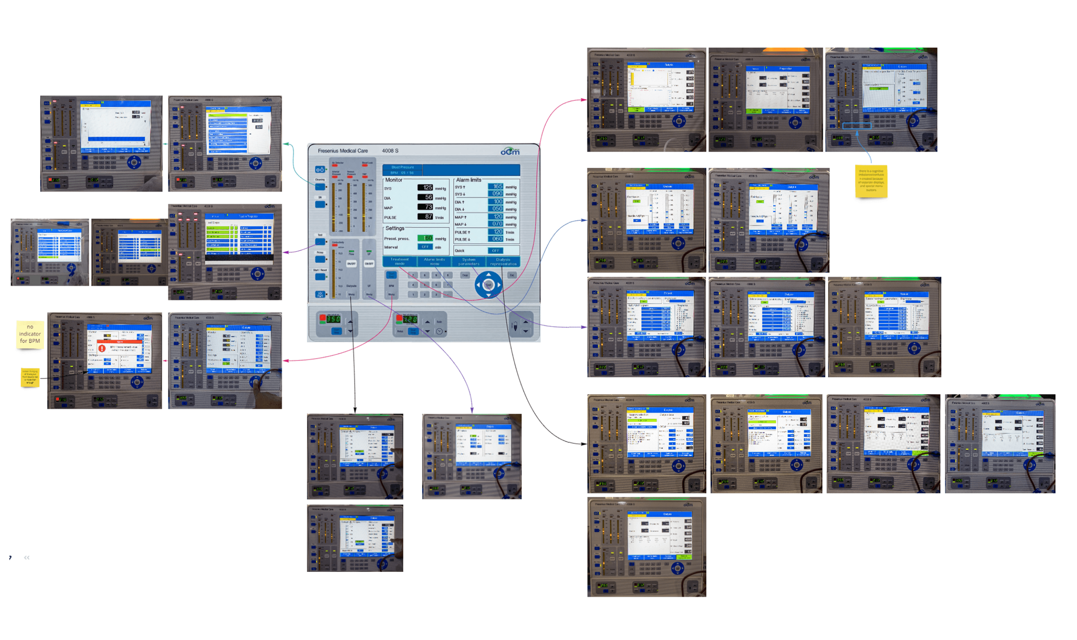
Complete information architecture mapping
To begin, I conducted a complete mapping of the dialysis process—tracking every step from machine setup to patient discharge. I documented how information was accessed, the order of interactions, the mental models of technicians, and the dependencies between different interface elements.
This helped me identify overlaps, missing cues, and moments of friction. For instance, multiple parameters were scattered across separate screens, requiring unnecessary navigation. Some critical alerts were buried under less relevant data.
By organizing all machine inputs, outputs, alarms, and action sequences into a coherent architecture, I was able to reframe the interface to match real-world usage. This ensured that the most important data appeared at the right time, in the right place, with the least cognitive effort—laying the groundwork for a user-centered redesign.
Approach & Analysis
I stood beside a nurse, with a camera, notebook & an empathetic eye.
She silenced the same alarm seven times in 10 minutes.
Interface Deconstruction
Mapped each screen and physical button.
Identified unnecessary repetition of alarms and data.
Analyzed real-time workflow and frequency of controls.Ergonomic Studies
Studied reach, glanceability, and grouping of controls.
Proposed removal of SN (Standard Dialysis) button — rarely used.
Created prototypes for matte screens to reduce glare and droplet visibility.GUI Redesign
Introduced clear typographic hierarchy, simple color coding, and icon reorganization.
Reduced the number of info windows.
Implemented touch-first navigation with membrane fallback.Control Panel Revision
Fused labels, indicators, and functions into coherent control clusters.
Replaced blinking LED matrix with status-priority-based lights.
Created low-fi and high-fi physical-digital control diagrams.


Design & Solution
Iterative problem solving
Mapped the Information Architecture
Began by understanding the medical workflow and interface logic to map the underlying structure.
Stripped Unnecessary Elements
Gradually removed redundant buttons, alerts, and unique controls to simplify the interface.
Defined Layout and Control Zones
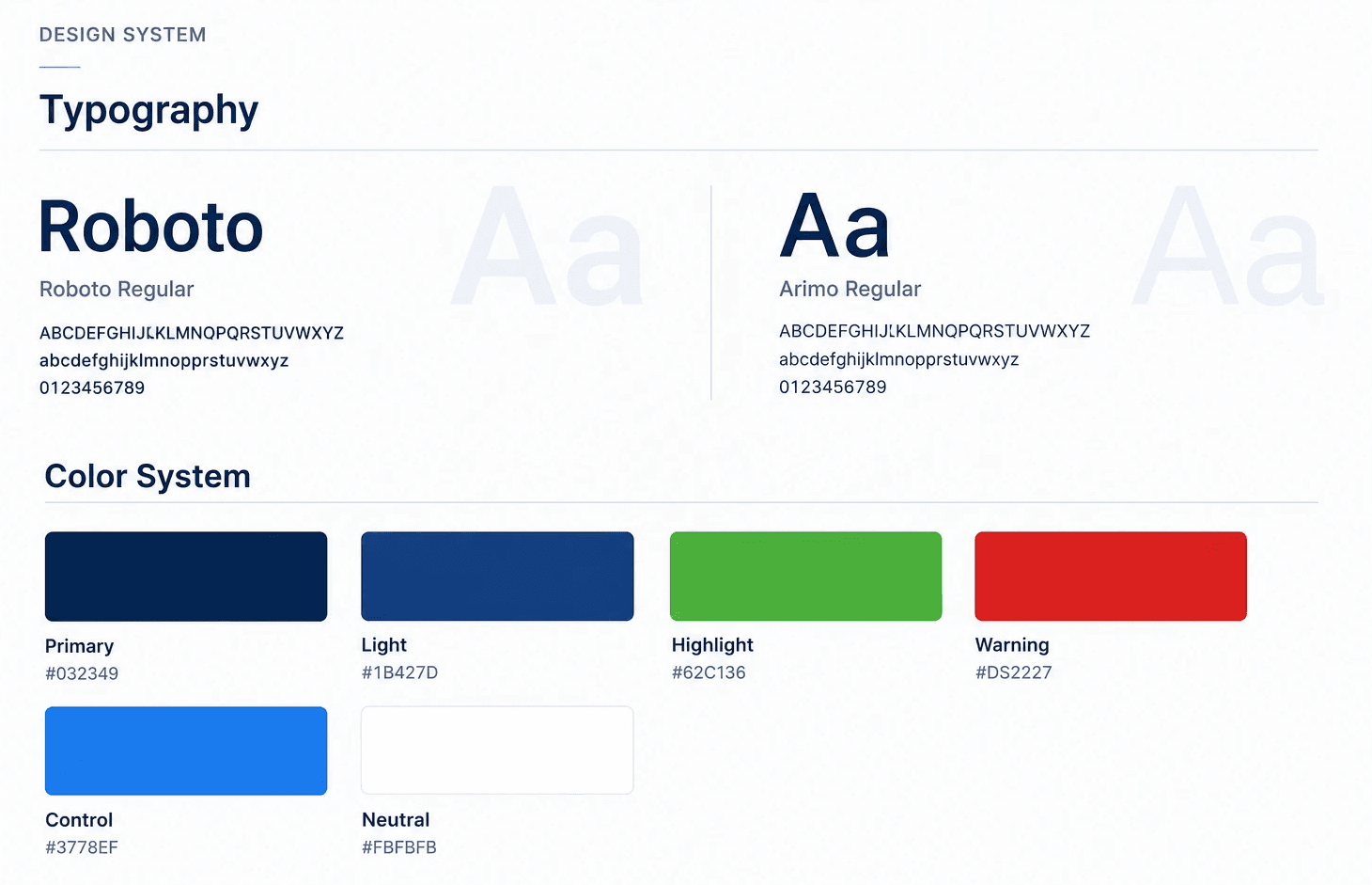
Finalized the placement of controls and display regions based on usage patterns and ergonomics.Built the Design System
Created a clear and readable design system with precise typography, spacing, and color guidelines—essential for handling dense numerical data.Chose Dark Mode by Context
Observed that dialysis rooms were dimly lit. Opted for dark mode as the default to reduce eye strain and blend into the clinical environment.Explored and Iterated Visual Styles
Iterated on component styling, iconography, and states using the design system, refining toward a calm, legible, and modern interface.




Impact
Real results from real people. I presented the designs to patients and the technicians to then extract a simulated success metrics.
Simulated Impact, Real Voices
Design feedback grounded in patient and technician response.
Prototyped, Presented, Proven
Insights gathered through real-user walkthroughs and simulated success metrics.
Grounded in Experience
Success indicators drawn from patient and technician feedback sessions.
Human-Centered Validation
Design outcomes shaped and affirmed by those who use it.
Reflections from the Frontline
Simulated metrics based on real feedback from patients and caregivers.

Final thoughts
“In healthcare, good design doesn’t just simplify—it softens, supports, and restores dignity in moments that matter most.”
Designing for a medical environment—especially one as sensitive and high-stakes as dialysis—taught me the real weight of interface decisions. Every alert, button, and data field directly affects how smoothly care is delivered and how comfortably patients endure long hours of treatment.
One of the key learnings was how much emotional and cognitive load medical staff carry. Simplifying their workflow wasn’t just about reducing clicks—it was about reducing fatigue, decision friction, and the ambient stress that fills a treatment room.
The impact of the redesign was both measurable and emotional: reduced cleaning time, less alarm fatigue, and calmer patients who could finally rest. But beyond metrics, what stood out most was the change in how the machine felt—less like a complex tool, more like a quiet, reliable companion in care.
This project deepened my belief that good design isn’t loud—it’s quietly powerful. And in healthcare, that quietness can make all the difference.
